# 1. onClickOutside
检测点击非常简单。但是,当点击发生在一个元素之外时,如何检测?那就有点棘手了。但使用 VueUse 中的 onClickOutside 组件就很容易能做到这点。
代码如下:
<script setup> | |
import { ref } from 'vue' | |
import { onClickOutside } from '@vueuse/core' | |
const container = ref(null) | |
onClickOutside(container, () => alert('Good. Better to click outside.')) | |
</script> | |
<template> | |
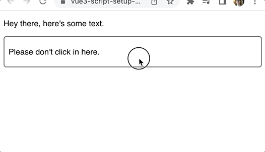
<div> | |
<p>Hey there, here's some text.</p> | |
<div class="container" ref="container"> | |
<p>Please don't click in here.</p> | |
</div> | |
</div> | |
</template> |
步骤:
1. 为想要追踪的 container 元素创建一个 ref :
const container = ref(null); |
2. 然后我们用元素上的 ref 属性把它变成一个模板 ref 。
<div class="container" ref="container"> | |
<p>Please don't click in here.</p> | |
</div> |
3. 有了容器的 ref 之后,我们把它和一个处理程序一起传递给 onClickOutside 组合。
onClickOutside( | |
container, | |
() => alert('Good. Better to click outside.') | |
) |
这种可组合对于管理窗口或下拉菜单很有用。当用户点击下拉菜单以外的地方时,你可以关闭它。
模态框也通常表现出这种行为。
# 2.useFocusTrap
将键盘焦点锁定在一个特定的 DOM 元素上,不是在整个页面中循环,而是在浏览器本身中循环,键盘焦点只在该 DOM 元素中循环。
下面是一个使用 VueUse 的 useFocusTrap 的例子:
<script setup> | |
import { ref } from 'vue' | |
import { useFocusTrap } from '@vueuse/integrations/useFocusTrap' | |
const container = ref(null) | |
useFocusTrap(container, { immediate: true }) | |
</script> | |
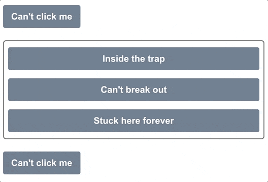
<template> | |
<div> | |
<button tab-index="-1">Can't click me</button> | |
<div class="container" ref="container"> | |
<button tab-index="-1">Inside the trap</button> | |
<button tab-index="-1">Can't break out</button> | |
<button tab-index="-1">Stuck here forever</button> | |
</div> | |
<button tab-index="-1">Can't click me</button> | |
</div> | |
</template> |
将 immediate 设置为 true ,页面加载时,焦点将被放置在 container 元素中。然后,就不可能在该容器之外的地方做标签。
到达第三个按钮后,再次点击 tab 键将回到第一个按钮。
步骤:
1. 就像 onClickOutside 一样,我们首先为 container 设置了模板 ref 。
const container = ref(null) |
<div class="container" ref="container"> | |
<button tab-index="-1">Inside the trap</button> | |
<button tab-index="-1">Can't break out</button> | |
<button tab-index="-1">Stuck here forever</button> | |
</div> |
2. 然后我们把这个模板引用传递给 useFocusTrap 组合。
useFocusTrap(container, { immediate: true }); |
immediate 选项将自动把焦点设置到容器内第一个可关注的元素上。
# 3. useHead
VueUse 为我们提供了一种简单的方法来更新我们应用程序的 head 部分 -- 页面 title、scripts 和其他可能放在这里的的东西。
useHead 组合要求我们首先设置一个插件
import { createApp } from 'vue' | |
import { createHead } from '@vueuse/head' | |
import App from './App.vue' | |
const app = createApp(App) | |
const head = createHead() | |
app.use(head) | |
app.mount('#app') |
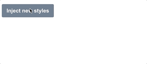
一旦我们使用了这个插件,我们就可以随心所欲地更新标题部分。在这个例子中,我们将在一个按钮上注入一些自定义样式。
<script setup> | |
import { ref } from 'vue' | |
import { useHead } from '@vueuse/head' | |
const styles = ref('') | |
useHead({ | |
// Inject a style tag into the head | |
style: [{ children: styles }], | |
}) | |
const injectStyles = () => { | |
styles.value = 'button { background: red }' | |
} | |
</script> | |
<template> | |
<div> | |
<button @click="injectStyles">Inject new styles</button> | |
</div> | |
</template> |
步骤:
1. 首先,我们创建一个 ref 来表示我们要注入的样式,默认为空:
const styles = ref(''); |
2. 其次,设置 useHead 将样式注入到页面中。
useHead({ | |
// Inject a style tag into the head | |
style: [{ children: styles }], | |
}) |
3. 然后,添加注入这些样式的方法:
const injectStyles = () => { | |
styles.value = 'button { background: red }' | |
} |
当然,我们并不局限于注入样式。我们可以在我们的 <head> 中添加任何这些内容:
- title
- meta tags
- link tags
- base tag
- style tags
- script tags
- html attributes
- body attributes
# 4. useStorage
useStorage 真的很酷,因为它会自动将 ref 同步到 localstorage,事例如下:
<script setup> | |
import { useStorage } from '@vueuse/core' | |
const input = useStorage('unique-key', 'Hello, world!') | |
</script> | |
<template> | |
<div> | |
<input v-model="input" /> | |
</div> | |
</template> |
第一次加载时, input 显示 'Hello, world!',但最后,它会显示你最后在 input 中输入的内容,因为它被保存在 localstorage 中。
除了 localstorage,我们也可以指定 sessionstorage :
const input = useStorage('unique-key', 'Hello, world!', sessionStorage) |
当然,也可以自己实现存储系统,只要它实现了 StorageLike 接口。
export interface StorageLike { | |
getItem(key: string): string | null | |
setItem(key: string, value: string): void | |
removeItem(key: string): void | |
} |
# 5. useVModel
v-model 指令是很好的语法糖,使双向数据绑定更容易。
但 useVModel 更进一步,摆脱了一堆没有人真正想写的模板代码。
<script setup> | |
import { useVModel } from '@vueuse/core' | |
const props = defineProps({ | |
count: Number, | |
}) | |
const emit = defineEmits(['update:count']) | |
const count = useVModel(props, 'count', emit) | |
</script> | |
<template> | |
<div> | |
<button @click="count = count - 1">-</button> | |
<button @click="count = 0">Reset to 0</button> | |
<button @click="count = count + 1">+</button> | |
</div> | |
</template> |
步骤:
1. 在这个例子中,我们首先定义了要附加到 v-model 上的 props:
const props = defineProps({ | |
count: Number, | |
}) |
2. 然后我们发出一个事件,使用 v-model 的命名惯例 update:<propName> :
const emit = defineEmits(['update:count']) |
3. 现在,我们可以使用 useVModel 组合来将 prop 和事件绑定到一个 ref 。
const count = useVModel(props, 'count', emit) |
每当 prop 发生变化时,这个 count 就会改变。但只要它从这个组件中被改变,它就会发出 update:count 事件,通过 v-model 指令触发更新。
我们可以像这样使用这个 Input 组件。
<script setup> | |
import { ref } from 'vue' | |
import Input from './components/Input.vue' | |
const count = ref(50) | |
</script> | |
<template> | |
<div> | |
<Input v-model:count="count" /> | |
<!--swig0--> | |
</div> | |
</template> |
这里的 count ref 是通过 v-model 绑定与 Input 组件内部的 count ref 同步的。
# 6. useImage
随着时间的推移,web 应用中的图像变得越来越漂亮。我们已经有了带有 srcset 的响应式图像,渐进式加载库,以及只有在图像滚动到视口时才会加载的库。
但你知道吗,我们也可以访问图像本身的加载和错误状态?
我以前主要通过监听每个 HTML 元素发出的 onload 和 onerror 事件来做到这一点,但 VueUse 给我们提供了一个更简单的方法,那就是 useImage 组合。

代码如下:
<script setup> | |
import { useImage } from '@vueuse/core' | |
// Change this to a non-existent URL to see the error state | |
const url = 'https://source.unsplash.com/random/400x300' | |
const { isLoading, error } = useImage( | |
{ | |
src: url, | |
}, | |
{ | |
// Just to show the loading effect more clearly | |
delay: 2000, | |
} | |
) | |
</script> | |
<template> | |
<div> | |
<div v-if="isLoading" class="loading gradient"></div> | |
<div v-else-if="error">Couldn't load the image :(</div> | |
<img v-else :src="url" /> | |
</div> | |
</template> |
1. 第一步,通过 useImage 设置图片的 src :
const { isLoading, error } = useImage({ src: url }) |
获取它返回的 isLoading 和 error 引用,以便跟踪状态。这个组合在内部使用 useAsyncState ,因此它返回的值与该组合的值相同。
2. 安排好后, useImage 就会加载我们的图像并将事件处理程序附加到它上面。
我们所要做的就是在我们的模板中使用相同的 URL 来使用该图片。由于浏览器会重复使用任何缓存的图片,它将重复使用由 useImage 加载的图片。
<template> | |
<div> | |
<div v-if="isLoading" class="loading gradient"></div> | |
<div v-else-if="error">Couldn't load the image :(</div> | |
<img v-else :src="url" /> | |
</div> | |
</template> |
在这里,我们设置了一个基本的加载和错误状态处理程序。当图片正在加载时,我们显示一个带有动画渐变的占位符。如果有错误,我们显示一个错误信息。否则我们可以渲染图像。
UseImage 还有其他一些很棒的特性!如果想让它成为响应式图像,那么它支持 srcset 和 sizes 属性,这些属性在幕后传递给 img 元素。
如果你想把所有内容都放在模板中,还有一个无渲染组件。它的工作原理与组合的相同:
<template> | |
<UseImage src="https://source.unsplash.com/random/401x301"> | |
<template #loading> | |
<div class="loading gradient"></div> | |
</template> | |
<template #error> | |
Oops! | |
</template> | |
</UseImage> | |
</template> |
# 7. 暗黑模式 useDark
最近,每个网站和应用程序似乎都有暗黑模式。最难的部分是造型的改变。但是一旦你有了这些,来回切换就很简单了。
如果你使用的是 Tailwind,你只需要在 html 元素中添加 dark 类,就可以在整个页面中启用。
<html class="dark"><!-- ... --></html> |
然而,在黑暗模式和光明模式之间切换时,有几件事需要考虑。首先,我们要考虑到用户的系统设置。第二,我们要记住他们是否已经推翻了这个选择。
VueUse 的 useDark 组合性为我们把所有这些东西都包起来。默认情况下,它查看系统设置,但任何变化都会被持久化到 localStorage ,所以设置会被记住。
<script setup> | |
import { useDark, useToggle } from '@vueuse/core' | |
const isDark = useDark() | |
const toggleDark = useToggle(isDark) | |
</script> | |
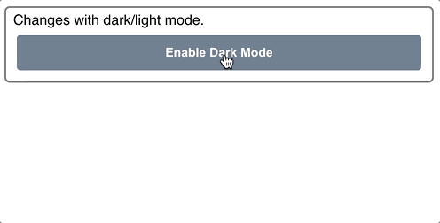
<template> | |
<div class="container"> | |
Changes with dark/light mode. | |
<button @click="toggleDark()"> | |
Enable <!--swig1--> Mode | |
</button> | |
</div> | |
</template> |
黑暗模式的样式:
.dark .container { | |
background: slategrey; | |
color: white; | |
border-color: black; | |
} | |
.dark button { | |
background: lightgrey; | |
color: black; | |
} | |
.dark body { | |
background: darkgrey; | |
} |
如果你没有使用 Tailwind,你可以通过传入一个选项对象来完全定制黑暗模式的应用方式。下面是默认的 Tailwind:
const isDark = useDark({ | |
selector: 'html', | |
attribute: 'class', | |
valueDark: 'dark', | |
valueLight: '', | |
}) |
也可以提供一个 onChanged 处理程序,这样你就可以编写任何你需要的 Javascript。这两种方法使你可以使它与你已有的任何造型系统一起工作。
# 总结
Vueuse 拥有一个巨大的库,其中包含出色的组合,而我们在这里只涵盖了其中的一小部分。我强烈建议你花些时间去探索这些文档,看看所有可用的东西。这是一个非常好的资源,它将使你免于大量的模板代码和不断地重新发明车轮。