最近在写元素周期表时,发现 svg 很多属性不是记得十分清楚,导致角度出问题,现在特来总结回顾一下
# 一、path 路径是什么?
path 路径是 svg 中最强大的图形
路径是由一系列命令所组成。 包括以下基本指令:
| 命令 | 名称 | 解释 | 参数 |
|---|---|---|---|
| M | moveto | 移动到 | (x y) |
| Z | closepath | 关闭路径 | (none) |
| L | lineto | 画线到 | (x y) |
| H | horizontal lineto | 水平线到 | x |
| V | vertical lineto | 垂直线到 | y |
| A | elliptical arc | 椭圆弧 | (rx ry x-axis-rotation large-arc-flag sweep-flag x y) |
| C | curveto | 三次贝塞尔曲线到 | (x1 y1 x2 y2 x y) |
| S | smooth curveto | 光滑三次贝塞尔曲线到 | (x2 y2 x y) |
| Q | Bézier curveto | 二次贝塞尔曲线到 | (x1 y1 x y) |
| T | smooth Bézier curveto | 光滑二次贝塞尔曲线到 | (x y) |
PS:如果指令字母是大写的,例如 M, 则表示坐标位置是绝对位置;如果指令字母小写的,例如 m, 则表示坐标位置是相对位置。
# 二、基本用法
<path d="M150 0 L75 200 L225 200 Z" /> | |
<!-- d 属性中包含所有路径的点,最后起点和终点连接起来形成闭合图形 --> | |
<path d="M150 0 L75 200 L225 200 Z" | |
fill="red" stroke="blue" stroke-width="10"/> |
# 三、高阶用法
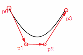
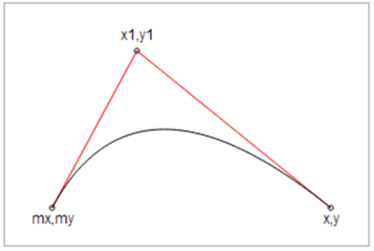
# 1. 三次贝塞尔曲线
| 格式 | Cx1 y1, x2 y2, x y |
|---|---|
| x1,y1 | 控制点 1 |
| x2,y2 | 控制点 2 |
| x,y | 曲线上的关键点 |
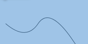
下面为曲线上的点随着时间的变化而变化的过程。
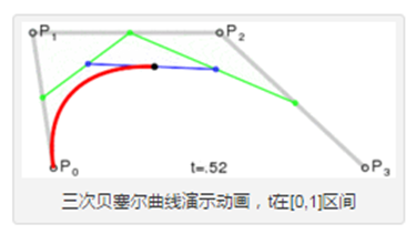
举个例子:
<path d="M20 20 C90 140,130 140,200 25" stroke="#000000" | |
fill="none" style="stroke-width: 2px;"/> | |
<!-- P0 为起点,P1 P2 P3 为决定三元贝塞尔曲线的点,如下图所示 --> |
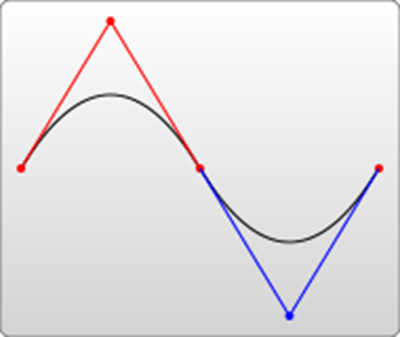
# 2. 光滑三次贝塞尔曲线
| 格式 | Sx2 y2, x y |
|---|---|
| S | S 指令跟在 C 指令或 S 指令后面补刀,它会自动在 C、S 基础上生成一个对称点,所以 S 指令只需要两个点就可以。 |
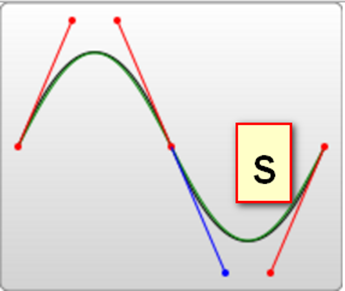
举个例子:
<path d="M20 80 C90 140, 130 140, 180 80 S250 60, 280 120" | |
stroke="#000000" fill="none" style="stroke-width: 2px;"/> |
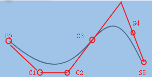
<!-- 试着自己画画下面这两个曲线吧 --> | |
<path d="M20 80 C90 140, 130 140, 180 80 S250 60, 280 120 S380 150, 450 80" | |
stroke="#000000" fill="none" style="stroke-width: 2px;"/> | |
<path d="M20 80 S80 150, 150 80" stroke="#000000" | |
fill="none" style="stroke-width: 2px;"/> |
# 3. 二次贝塞尔曲线
| 格式 | Qx1 y1, x y |
|---|---|
| x1,y1 | 控制点 |
| x,y | 曲线的终点 |
下面为曲线上的点随着时间的变化而变化的过程。
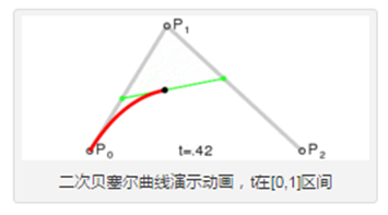
举个例子:
<path d="M20 80 Q90 140, 130 80" stroke="#000000" | |
fill="none" style="stroke-width: 2px;"/> |
# 4. 光滑二次贝塞尔曲线
| 格式 | Tx y |
|---|---|
| T | T 指令和 S 指令类似,是给 Q、T 指令补刀的 |
| T 指令只有一个曲线终点,没有控制点 (由 Q 的对称点自动生成) | |
| 也可以单独使用,当单独使用时,是一条直线 |
举个例子:
<path d="M20 80 Q90 140, 130 80 T250 140 T350 40 " | |
stroke="#000000" fill="none" style="stroke-width: 2px;"/> | |
<path d="M20 80 T350 140 " stroke="#000000" | |
fill="none" style="stroke-width: 2px;"/> |
# 5. 圆弧
| 格式 | A rx ry x-deg large-arc sweep-flag x y |
|---|---|
| rx ry | x 轴半径和 y 轴半径 |
| x-deg | x 轴旋转角度,large-arc 表示大于 180 度还是小于 180 度 (0 为小,1 为大) |
| sweep-flag | 弧线方向 (0 为沿逆时针,1 为沿顺时针) |
| x y | 最终坐标 |
举个例子:
<path d="M80 80 A45 45, 0, 0, 0, 125 125" fill="green" /> |

# 四、属性详解(全)
# 1. 所有形状
SVG 提供了很多可用来画图的形状,如下是常见的形状。
| S.N. | 形状类别和描述 |
|---|---|
| 1 | rect(矩形)可以画一个矩形。 |
| 2 | circle(圆)可以画一个圆。 |
| 3 | ellipse(椭圆)可以画一个椭圆。 |
| 4 | line(线条)可以画一条线。 |
| 5 | polygon(多边形)可以画一个由直线连接起来的闭合形状。 |
| 6 | polyline(折线)可以画一条由直线连接起来的非闭合形状。 |
| 7 | path(路径)可以画任何路径。 |
# 2.SVG Rect(矩形)
<rect> 元素用来画一个矩形,该矩形的轴与当前 <SVG></SVG> 容器的坐标系对齐。
# 语法
以下是 <rect> 元素的语法声明,这里只显示主要属性。
<rect | |
x="x轴坐标" | |
y="y轴坐标" | |
width="长度" | |
height="长度" | |
rx="长度" | |
ry="长度" | |
style="样式" | |
class="样式" > | |
</rect> |
# 属性
| S.N. | 名称与说明 |
|---|---|
| 1 | x - 矩形左上角的 x 轴坐标。默认为 0. |
| 2 | y - 矩形左上角的 y 轴坐标。默认为 0. |
| 3 | width - 矩形宽度. |
| 4 | height - 矩形高度. |
| 5 | rx - 设置圆角矩形的弧度. |
| 6 | ry - 设置圆角矩形的弧度. |
| 7 | style - 设置样式. |
| fill - 填充颜色 | |
| stroke-width - 边框的宽度 | |
| stroke - 边框的颜色 | |
| stroke-opacity - 边框透明度 | |
| opacity - 矩形透明度 | |
| 8 | class - 使用的 css 样式名. |
# 实例
<html> | |
<title>SVG矩形</title> | |
<body> | |
<h1>SVG矩形实例</h1> | |
<svg width="400" height="550"> | |
<g> | |
<text x="0" y="15" fill="black" > | |
矩形 #1: 不透明.</text> | |
<rect x="100" y="30" width="300" height="100" | |
style="fill:rgb(121,0,121);stroke-width:3;stroke:rgb(0,0,0)"> | |
</g> | |
<g> | |
<text x="0" y="215" fill="black" > | |
矩形 #2: 透明 </text> | |
<rect x="100" y="230" width="300" height="100" | |
style="fill:rgb(121,0,121);stroke-width:3;stroke:rgb(0,0,0);stroke-opacity:0.5;opacity:0.5"> | |
</g> | |
<g> | |
<text x="0" y="415" fill="black" > | |
矩形 #3: 有圆角 </text> | |
<rect x="100" y="430" rx="10" ry="10" width="300" height="100" | |
style="fill:rgb(121,0,121);stroke-width:3;stroke:rgb(0,0,0);"> | |
</g> | |
</svg> | |
</body> | |
</html> |
# 输出
在 Chrome 浏览器上打开文件,你能用 Chrome/Firefox/Opera 或 IE9 + 直接看到 SVG 图像而不用任何插件,在 IE8 里需要使用 activeX 控件才能看 SVG 图像。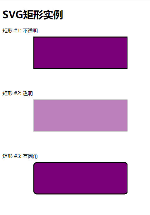
# SVG 矩形的坐标解释
可能很多初学者对 SVG 矩形的坐标不太理解,下面通过一个实例给予解释一下。
<html> | |
<title>SVG矩形坐标说明</title> | |
<body> | |
<h1>SVG矩形坐标说明</h1> | |
<svg width="450" height="550" style="background-color:#ccc"> | |
<g> | |
<rect x="100" y="30" width="100" height="100" | |
style="fill:rgb(121,0,121);stroke-width:3;stroke:rgb(0,0,0)"> | |
</g> | |
<g> | |
<rect x="100" y="230" width="200" height="100" | |
style="fill:rgb(121,0,121);stroke-width:3;stroke:rgb(0,0,0); | |
stroke-opacity:0.5;opacity:0.5"> | |
</g> | |
<g> | |
<rect x="100" y="430" rx="10" ry="10" width="300" height="100" | |
style="fill:rgb(121,0,121);stroke-width:3;stroke:rgb(0,0,0);"> | |
</g> | |
</svg> | |
</body> | |
</html> |
# 输出
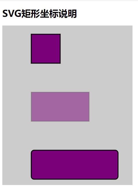
坐标原点(0,0)是 <svg></svg> 容器的起始位置,而矩形 (rect) 的坐标起点(矩形左上角)则是相对于原点(0,0) 的位置。
# 3.SVG Circle(圆)
<circle> 元素用来画一个圆,它是通过给定一个圆心和半径来绘制的。
# 语法
下面是 <circle> 元素的语法声明,这里只给出主要的属性。
<circle | |
cx="x轴坐标" | |
cy="y轴坐标" | |
r="长度" > | |
</circle> |
# 属性
| S.N. | 名称和描述 |
|---|---|
| 1 | cx - 圆心 x 轴坐标,默认为 0。 |
| 2 | cy - 圆心 y 轴坐标,默认为 0。 |
| 3 | r - 圆的半径。 |
# 实例
<html> | |
<title>SVG Circle</title> | |
<body> | |
<h1>SVG画圆实例</h1> | |
<svg width="350" height="400"> | |
<g> | |
<text x="0" y="15" fill="black">圆 #1. 不透明</text> | |
<circle cx="100" cy="100" r="50" stroke="black" | |
stroke-width="3" fill="rgb(121,0,121)"> | |
</g> | |
<g> | |
<text x="0" y="215" fill="black" >圆 #2. 透明 </text> | |
<circle cx="100" cy="300" r="50" | |
style="fill:rgb(121,0,121);stroke-width:3;stroke:rgb(0,0,0);stroke-opacity:0.5;opacity:0.5"> | |
</g> | |
</svg> | |
</body> | |
</html> |
# 输出
在 Chrome 浏览器上打开文件,你能用 Chrome/Firefox/Opera 或 IE9 + 直接看到 SVG 图像而不用任何插件,在 IE8 里需要使用 activeX 控件才能看 SVG 图像。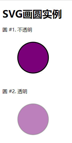
实例中,使用了 style(样式),这里说下几个样式的含义。fill - 填充颜色,none 表示不填充颜色,stroke-width - 图边的宽度 , stroke - 图边的颜色 , stroke-opacity - 图边透明度 , opacity - 图形透明度 。
# 4.SVG Ellipse(椭圆)
<ellipse> 元素是用来画椭圆的,它是由给定的圆心、x 轴半径以及 y 轴半径来绘制的。
# 语法
如下是 <ellipse> 的语法,这里只介绍几个主要的属性。
<ellipse | |
cx="x轴坐标" | |
cy="y轴坐标" | |
rx="长度" | |
ry="长度" > | |
</ellipse> |
# 属性
| S.N. | 名称和说明 |
|---|---|
| 1 | cx - 椭圆的 x 轴坐标,默认为 0。 |
| 2 | cy - 椭圆的 y 轴坐标,默认为 0。 |
| 3 | rx - 椭圆的 x 轴半径。 |
| 4 | ry - 椭圆的 y 轴坐标。 |
# 实例
<html> | |
<title>SVG Ellipse(椭圆)</title> | |
<body> | |
<h1>SVG椭圆实例</h1> | |
<svg width="300" height="400"> | |
<g> | |
<text x="0" y="15" fill="black" >椭圆 #1: 不透明.</text> | |
<ellipse cx="100" cy="100" rx="90" ry="50" | |
stroke="black" stroke-width="3" fill="rgb(121,0,121)"> | |
</g> | |
<g> | |
<text x="0" y="215" fill="black" >椭圆 #2: 透明 </text> | |
<ellipse cx="100" cy="300" rx="90" ry="50" | |
style="fill:rgb(121,0,121);stroke-width:3;stroke:rgb(0,0,0);stroke-opacity:0.5;opacity:0.5"> | |
</g> | |
</svg> | |
</body> | |
</html> |
# 输出
在 Chrome 浏览器上打开文件,你能用 Chrome/Firefox/Opera 或 IE9 + 直接看到 SVG 图像而不用任何插件,在 IE8 里需要使用 activeX 控件才能看 SVG 图像。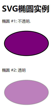
实例中,使用了 style(样式),这里说下几个样式的含义。fill - 填充颜色,none 表示不填充颜色,stroke-width - 图边的宽度 , stroke - 图边的颜色 , stroke-opacity - 图边透明度 , opacity - 图形透明度 。
# 5.SVG Line(直线)
<line> 元素用来画一条线,它是通过给定的起点坐标和终点坐标来绘制的。
# 语法
下面是 <line> 元素的语法,这里只介绍主要的属性。
<line | |
x1="x轴坐标" | |
y1="y轴坐标" | |
x2="x轴坐标" | |
y2="y轴坐标" > | |
</line> |
# 属性
| S.N. | 名称和描述 |
|---|---|
| 1 | x1 - 起点的 x 轴坐标,默认为 0。 |
| 2 | y1 - 起点的 y 轴坐标,默认为 0。 |
| 3 | x2 - 终点的 x 轴坐标,默认为 0。 |
| 4 | y2 - 终点的 y 轴坐标,默认为 0。 |
# 实例
<html> | |
<title>SVG直线实例</title> | |
<body> | |
<h1>SVG直线实例</h1> | |
<svg width="300" height="350"> | |
<g> | |
<text x="0" y="15" fill="black" >直线 #1: 不透明.</text> | |
<line x1="20" y1="20" x2="150" y2="150" | |
stroke="black" stroke-width="3" fill="rgb(121,0,121)"> | |
</g> | |
<g> | |
<text x="0" y="215" fill="black" >直线 #2: 透明 </text> | |
<line x1="20" y1="220" x2="150" y2="350" | |
style="fill:rgb(121,0,121);stroke-width:3;stroke:rgb(0,0,0);stroke-opacity:0.5;opacity:0.5"> | |
</g> | |
</svg> | |
</body> | |
</html> |
# 输出
在 Chrome 浏览器上打开文件,你能用 Chrome/Firefox/Opera 或 IE9 + 直接看到 SVG 图像而不用任何插件,在 IE8 里需要使用 activeX 控件才能看 SVG 图像。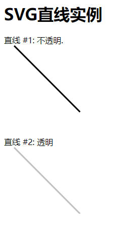
实例中,使用了 style(样式),这里说下几个样式的含义。fill - 填充颜色,none 表示不填充颜色,stroke-width - 图边的宽度 , stroke - 图边的颜色 , stroke-opacity - 图边透明度 , opacity - 图形透明度 。
# 6.SVG Polygon(多边形)
<polygon> 元素是用来画多边形的。
# 语法
下面是 <polygon> 的语法声明,这里只介绍主要的属性。
<polygon | |
points="一系列点" > | |
</polygon> |
# 属性
| S.N. | 名称和描述 |
|---|---|
| 1 | points - 绘制多边形的一系列点。 |
# 实例
<html> | |
<title>SVG多边形</title> | |
<body> | |
<h1>SVG多边形实例</h1> | |
<svg width="300" height="600"> | |
<g> | |
<text x="0" y="15" fill="black" >多边形 #1: 不透明.</text> | |
<polygon points="150,75 258,137.5 258,262.5 150,325 42,262.6 42,137.5" | |
stroke="black" stroke-width="3" fill="rgb(121,0,121)"> | |
</g> | |
<g> | |
<text x="0" y="360" fill="black" >多边形 #2: 透明 </text> | |
<polygon points="150,375 258,437.5 258,562.5 150,625 42,562.6 42,437.5" | |
style="fill:rgb(121,0,121);stroke-width:3;stroke:rgb(0,0,0);stroke-opacity:0.5;opacity:0.5"> | |
</g> | |
</svg> | |
</body> | |
</html> |
# 输出
在 Chrome 浏览器上打开文件,你能用 Chrome/Firefox/Opera 或 IE9 + 直接看到 SVG 图像而不用任何插件,在 IE8 里需要使用 activeX 控件才能看 SVG 图像。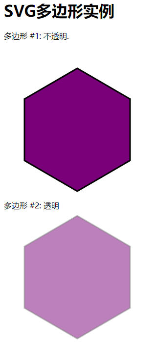
细心的网友注意到 图 #2 中的多边形,下面的角没了,6 角形变成了 7 角形,这是因为 SVG 容器的高度(height)不够,导致超出范围的图形被自动截去了。修改代码,把 SVG 的 height 设置为 800,图形便能显示完整了。在实例中 “试一试” 看看对不?
实例中,使用了 style(样式),这里说下几个样式的含义。fill - 填充颜色,none 表示不填充颜色,stroke-width - 图边的宽度 , stroke - 图边的颜色 , stroke-opacity - 图边透明度 , opacity - 图形透明度 。
# 7.SVG Polyline(折线)
<polyline> 元素是用来画折线的。
# 语法
下面是 <polyline> 的语法声明,这里只介绍主要的属性
<polyline | |
points="一系列点" > | |
</polyline> |
# 属性
| S.N. | 名称和描述 |
|---|---|
| 1 | points - 绘制折线的一系列点. |
# 实例
<html> | |
<title>SVG折线</title> | |
<body> | |
<h1>SVG折线实例</h1> | |
<svg width="300" height="630"> | |
<g> | |
<text x="0" y="15" fill="black" >折线 #1: 不透明.</text> | |
<polyline points="150,75 258,137.5 258,262.5 150,325 42,262.6 42,137.5" | |
stroke="black" stroke-width="3" fill="none"> | |
</g> | |
<g> | |
<text x="0" y="360" fill="black" >折线 #2: 透明 </text> | |
<polyline points="150,375 258,437.5 258,562.5 150,625 42,562.6 42,437.5" | |
style="fill:none;stroke-width:3;stroke:rgb(0,0,0);stroke-opacity:0.5;"> | |
</g> | |
</svg> | |
</body> | |
</html> |
# 输出
在 Chrome 浏览器上打开文件,你能用 Chrome/Firefox/Opera 或 IE9 + 直接看到 SVG 图像而不用任何插件,在 IE8 里需要使用 activeX 控件才能看 SVG 图像。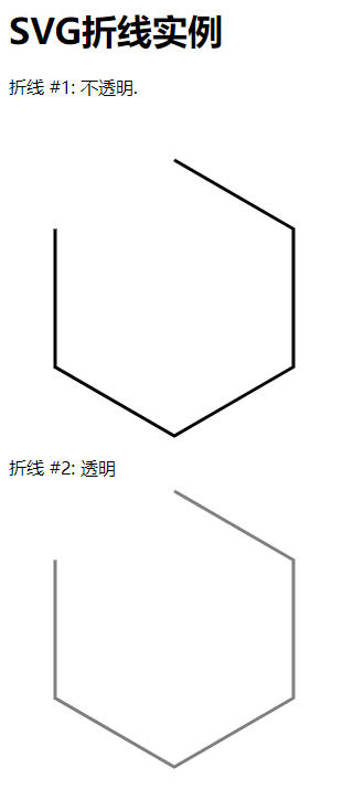
实例中,使用了 style(样式),这里说下几个样式的含义。fill - 填充颜色,none 表示不填充颜色,stroke-width - 图边的宽度 , stroke - 图边的颜色 , stroke-opacity - 图边透明度 , opacity - 图形透明度 。
# 8.SVG Path(路径)
<path> 元素是用来画一条闭合直线。
# 语法
下面是 <path> 的语法声明,这里只介绍主要的属性。
<path | |
d="data" > | |
</path> |
# 属性
| S.N. | 名称和描述 |
|---|---|
| 1 | d - 路径数据,通常是一组命令,例如 moveto、lineto 等。 |
<path> 元素被用来定义任何路径。Path 元素使用 Path 数据,这些数据包含很多命令,这些命令就好像是拿着一支笔在移动画出一条路径。
| S.N. | 命令和描述 |
|---|---|
| 1 | M - moveto - 从一点移到另一点. |
| 2 | L - lineto - 创建一条线. |
| 3 | H - horizontal lineto - 创建一条水平线. |
| 4 | V - vertical lineto - 创建一条竖线. |
| 5 | C - curveto - 创建一条曲线. |
| 6 | S - smooth curveto - 创建一条平滑曲线. |
| 7 | Q - quadratic Bezier curve - 创建一个二次贝塞尔曲线. |
| 8 | T - smooth quadratic Bezier curveto - 创建一个平滑二次贝塞尔曲线. |
| 9 | A - elliptical Arc - 创建一个椭圆弧. |
| 10 | Z - closepath - 关闭路径. |
上述命令使用大写字母,代表绝对路径,如果使用小写字母,则使用相对路径。
# 实例
<html> | |
<title>SVG路径</title> | |
<body> | |
<h1>SVG路径实例</h1> | |
<svg width="400" height="450"> | |
<g> | |
<text x="0" y="15" fill="black" >路径 #1: 不透明.</text> | |
<path d="M 100 50 L 300 50 L 200 200 z" | |
stroke="black" stroke-width="3" fill="rgb(121,0,121)"> | |
</g> | |
<g> | |
<text x="0" y="260" fill="black" >路径 #2: 透明 </text> | |
<path d="M 100 300 L 300 300 L 200 400 z" | |
style="fill:rgb(121,0,121);stroke-width:3;stroke:rgb(0,0,0);stroke-opacity:0.5;"> | |
</g> | |
</svg> | |
</body> | |
</html> |
上面实例中,第一个图,M 100 50 移动画笔到 (100,50),L 300 50 画一条线从 (100,50) 到 (300,50),L 200 200 画一条线从 (300,50) 到 (200,200),z 关闭路径。
# 输出
在 Chrome 浏览器上打开文件,你能用 Chrome/Firefox/Opera 或 IE9 + 直接看到 SVG 图像而不用任何插件,在 IE8 里需要使用 activeX 控件才能看 SVG 图像。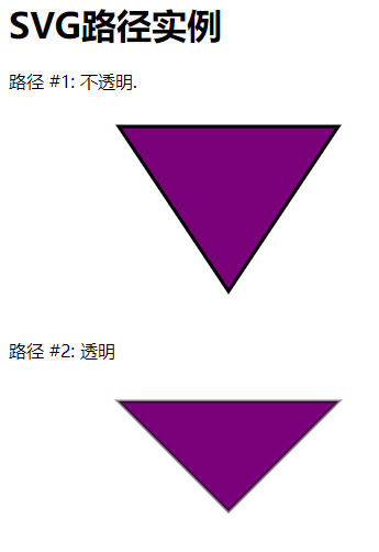
实例中,使用了 style(样式),这里说下几个样式的含义。fill - 填充颜色,none 表示不填充颜色,stroke-width - 图边的宽度 , stroke - 图边的颜色 , stroke-opacity - 图边透明度 , opacity - 图形透明度 。
# 9.SVG Text(文本)
<text> 元素是用来绘制文本的。
# 语法
下面是 <text> 的语法声明,这里只介绍主要的属性。
<text | |
x="x轴坐标" | |
y="y轴坐标" | |
dx="长度" | |
dy="长度" | |
rotate="数字" | |
textlength="长度" | |
lengthAdjust="spacing" > | |
</text> |
# 属性
| Sr.No. | 属性与描述 |
|---|---|
| 1 | x − x 轴坐标. |
| 2 | y − y 轴坐标. |
| 3 | dx − 偏移 x 轴长度. |
| 4 | dy − 偏移 y 轴长度. |
| 5 | tspan − 多行文本. |
| 6 | textlength − 文本长度. |
| 7 | lengthAdjust − 调整间距. |
| 8 | rotate − 转动角度. |
| 9 | xlink:href − 文本超链接. |
# 实例
<html> | |
<title>SVG文本</title> | |
<body> | |
<h1>SVG文本实例</h1> | |
<svg width="300" height="200"> | |
<g> | |
<text x="30" y="12" >Text: </text> | |
<text x="30" y="30" fill="rgb(121,0,121)">School.WebKaka.COM</text> | |
</g> | |
</svg> | |
</body> | |
</html> |
# 输出
在 Chrome 浏览器上打开文件,你能用 Chrome/Firefox/Opera 或 IE9 + 直接看到 SVG 图像而不用任何插件,在 IE8 里需要使用 activeX 控件才能看 SVG 图像。
# 多行文本
<html> | |
<title>SVG文本实例</title> | |
<body> | |
<h1>SVG文本实例</h1> | |
<svg width="300" height="200"> | |
<g> | |
<text x="30" y="12" >多行文本: </text> | |
<text x="30" y="30" fill="rgb(121,0,121)">School.WebKaka.COM | |
<tspan x="30" y="50" font-weight="bold">你的网上学习园地.</tspan> | |
<tspan x="30" y="70">所有教程都是免费的.</tspan> | |
</text> | |
</g> | |
</svg> | |
</body> | |
</html> |
# 输出
在 Chrome 浏览器上打开文件,你能用 Chrome/Firefox/Opera 或 IE9 + 直接看到 SVG 图像而不用任何插件,在 IE8 里需要使用 activeX 控件才能看 SVG 图像。
上图看到,第一行的文本上部被遮住了,我们可以设置一下 dy,让文本偏移 y 轴 2px,写法如下:
<text x="30" y="12" dy="2">多行文本: </text> |
# 文本长度
<html> | |
<title>SVG文本</title> | |
<body> | |
<h1>SVG文本实例</h1> | |
<svg width="300" height="200"> | |
<g> | |
<text x="30" y="12" dy="2">文本默认长度 </text> | |
<text x="30" y="38" textlength="200" fill="rgb(121,0,121)">文本长度设为200</text> | |
<text x="30" y="60" fill="rgb(0,0,0)">School.WebKaka.COM</text> | |
</g> | |
</svg> | |
</body> | |
</html> |
# 输出
在 Chrome 浏览器上打开文件,你能用 Chrome/Firefox/Opera 或 IE9 + 直接看到 SVG 图像而不用任何插件,在 IE8 里需要使用 activeX 控件才能看 SVG 图像。
# 转动文本
<html> | |
<title>SVG文本</title> | |
<body> | |
<h1>SVG文本实例</h1> | |
<svg width="300" height="130"> | |
<g> | |
<text x="30" y="12" >转动文本: </text> | |
<text x="30" y="30"fill="rgb(121,0,121)" | |
transform="rotate(30 20,40)" >School.WebKaka.COM</text> | |
</g> | |
</svg> | |
</body> | |
</html> |
# 输出
在 Chrome 浏览器上打开文件,你能用 Chrome/Firefox/Opera 或 IE9 + 直接看到 SVG 图像而不用任何插件,在 IE8 里需要使用 activeX 控件才能看 SVG 图像。
# 文本超链接
<html> | |
<title>SVG文本实例</title> | |
<body> | |
<h1>SVG文本实例</h1> | |
<svg width="300" height="200"> | |
<g> | |
<text x="30" y="10" dy="4">文本链接: </text> | |
<a xlink:href="http://school.webkaka.com/svg/" target="_blank"> | |
<text font-family="Verdana" font-size="20" x="30" y="40" | |
fill="rgb(121,0,121)">School.WebKaka.COM</text> | |
</a> | |
</g> | |
</svg> | |
</body> | |
</html> |
# 输出
在 Chrome 浏览器上打开文件,你能用 Chrome/Firefox/Opera 或 IE9 + 直接看到 SVG 图像而不用任何插件,在 IE8 里需要使用 activeX 控件才能看 SVG 图像。
在此例中,使用 dy=4 调整文本 y 轴偏移长度,否则,文本上部被遮住显示不出来。
# 10.SVG Stroke 属性
SVG 支持多 Stroke 属性。
如下是主要使用的 Stroke 属性。
| No. | Stroke 类型和描述 |
|---|---|
| 1 | stroke − 定义文本、线条和元素轮廓的颜色. |
| 2 | stroke-width − 定义文本、线条和元素轮廓的厚度. |
| 3 | stroke-linecap − 定义线条或路径轮廓的端点类型(butt、round、square). |
| 4 | stroke-dasharray − 用来创建虚线. |
# 实例:Stroke
<html> | |
<title>SVG Stroke</title> | |
<body> | |
<h1>SVG Stroke实例</h1> | |
<svg width="300" height="400"> | |
<g> | |
<text x="30" y="30" >使用stroke: </text> | |
<path stroke="red" d="M 50 50 L 300 50" /> | |
<path stroke="green" d="M 50 70 L 300 70" /> | |
<path stroke="blue" d="M 50 90 L 300 90" /> | |
</g> | |
</svg> | |
</body> | |
</html> |
# 输出
在 Chrome 浏览器上打开文件,你能用 Chrome/Firefox/Opera 或 IE9 + 直接看到 SVG 图像而不用任何插件,在 IE8 里需要使用 activeX 控件才能看 SVG 图像。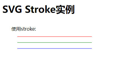
# 实例:Stroke-width
<html> | |
<title>SVG Stroke实例</title> | |
<body> | |
<h1>SVG Stroke实例</h1> | |
<svg width="300" height="400"> | |
<text x="30" y="10" dy="4">使用stroke-width: </text> | |
<path stroke-width="2" stroke="black" d="M 50 50 L 300 50" /> | |
<path stroke-width="4" stroke="black" d="M 50 70 L 300 70" /> | |
<path stroke-width="6" stroke="black" d="M 50 90 L 300 90" /> | |
</svg> | |
</body> | |
</html> |
# 输出
在 Chrome 浏览器上打开文件,你能用 Chrome/Firefox/Opera 或 IE9 + 直接看到 SVG 图像而不用任何插件,在 IE8 里需要使用 activeX 控件才能看 SVG 图像。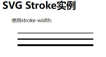
# 实例:stroke-linecap
<html> | |
<title>SVG Stroke实例</title> | |
<body> | |
<h1>SVG Stroke实例</h1> | |
<svg width="300" height="400"> | |
<g> | |
<text x="30" y="30" >使用stroke-linecap: </text> | |
<path stroke-linecap="butt" stroke-width="6" | |
stroke="black" d="M 50 50 L 300 50" /> | |
<path stroke-linecap="round" stroke-width="6" | |
stroke="black" d="M 50 70 L 300 70" /> | |
<path stroke-linecap="square" stroke-width="6" | |
stroke="black" d="M 50 90 L 300 90" /> | |
</g> | |
</svg> | |
</body> | |
</html> |
# 输出
在 Chrome 浏览器上打开文件,你能用 Chrome/Firefox/Opera 或 IE9 + 直接看到 SVG 图像而不用任何插件,在 IE8 里需要使用 activeX 控件才能看 SVG 图像。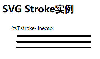
# 实例:stroke-dasharray
<html> | |
<title>SVG Stroke</title> | |
<body> | |
<h1>SVG Stroke实例</h1> | |
<svg width="300" height="400"> | |
<g> | |
<text x="30" y="30" >使用stroke-dasharray: </text> | |
<path stroke-dasharray="5,5" stroke-width="6" | |
stroke="black" d="M 50 50 L 300 50" /> | |
<path stroke-dasharray="10,10" stroke-width="6" | |
stroke="black" d="M 50 70 L 300 70" /> | |
<path stroke-dasharray="20,10,5,5,5,10" stroke-width="6" | |
stroke="black" d="M 50 90 L 300 90" /> | |
</g> | |
</svg> | |
</body> | |
</html> |
# 输出
在 Chrome 浏览器上打开文件,你能用 Chrome/Firefox/Opera 或 IE9 + 直接看到 SVG 图像而不用任何插件,在 IE8 里需要使用 activeX 控件才能看 SVG 图像。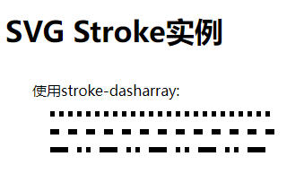
# 11.SVG Filters(过滤器)
SVG 使用 <filter> 元素定义过滤器。 <filter> 元素使用 ID 属性作为唯一标识。过滤器在 <def> 元素里定义,然后通过它们的 ID 在图形元素里引用。
SVG 提供丰富的过滤器设置,如下列表是常用的过滤器。
- feBlend
- feColorMatrix
- feComponentTransfer
- feComposite
- feConvolveMatrix
- feDiffuseLighting
- feDisplacementMap
- feFlood
- feGaussianBlur
- feImage
- feMerge
- feMorphology
- feOffset - filter for drop shadows
- feSpecularLighting
- feTile
- feTurbulence
- feDistantLight
- fePointLight
- feSpotLight
# 说明
如下是 <filter> 元素的语法说明,这里只介绍主要的属性。
<filter | |
filterUnits="定义过滤器区域单元" | |
primitiveUnits="定义过滤器次区域单元" | |
x="x轴坐标" | |
y="y轴坐标" | |
width="长度" | |
height="长度" | |
filterRes="过滤器区域数目" | |
xlink:href="引用另一个过滤器" > | |
</filter> |
# 属性
| NO. | 名称和描述 |
|---|---|
| 1 | filterUnits − 定义过滤器效应区域单元。它指定了在过滤器内的各种长度值的坐标系和定义过滤器次区域的属性。如果 filterUnits="userSpaceOnUse",值表示是当前用户坐标系内的值;如果 filterUnits="objectBoundingBox",值表示包围盒子的分数或百分比值。默认是 userSpaceOnUse。 |
| 2 | primitiveUnits − 定义过滤器效应次区域单元。它指定了在过滤器内的各种长度值的坐标系和定义过滤器次区域的属性。如果 filterUnits="userSpaceOnUse",值表示是当前用户坐标系内的值;如果 filterUnits="objectBoundingBox",值表示包围盒子的分数或百分比值。默认是 userSpaceOnUse。 |
| 3 | x − 过滤器盒子的 x 轴坐标,默认是 0。 |
| 4 | y − 过滤器盒子的 y 轴坐标,默认是 0。 |
| 5 | width − 过滤器盒子的宽度,默认是 0。 |
| 6 | height − 过滤器盒子的高度,默认是 0。 |
| 7 | filterRes − 过滤器区域数。 |
| 8 | xlink:href − 用来引用另一个过滤器。 |
# 实例:模糊效果
<html> | |
<title>SVG Filter</title> | |
<body> | |
<h1>SVG Filter实例</h1> | |
<svg width="300" height="400"> | |
<defs> | |
<filter id="filter1" x="0" y="0"> | |
<feGaussianBlur in="SourceGraphic" stdDeviation="8" /> | |
</filter> | |
<filter id="filter2" x="0" y="0" width="200%" height="200%"> | |
<feOffset result="offOut" in="SourceAlpha" dx="20" dy="20" /> | |
<feGaussianBlur result="blurOut" in="offOut" stdDeviation="10" /> | |
<feBlend in="SourceGraphic" in2="blurOut" mode="normal" /> | |
</filter> | |
</defs> | |
<g> | |
<text x="30" y="50" >使用过滤器(模糊效果): </text> | |
<rect x="100" y="100" width="90" height="90" stroke="green" stroke-width="3" | |
fill="green" filter="url(#filter1)" /> | |
</g> | |
</svg> | |
</body> | |
</html> |
- 两个
<filter>元素定义 filter1 和 filter2. - feGaussianBlur 滤镜效果定义模糊效果,使用 stdDeviation 定义大量的模糊效果.
- in="SourceGraphic" 定义效果应用于整个元素.
- feOffset 滤镜效果用于创建阴影效果,in="SourceAlpha" 定义效果应用于 RGBA 图形的 alpha 部分.
<rect>元素使用过滤器属性连接过滤器.
# 输出
在 Chrome 浏览器上打开文件,你能用 Chrome/Firefox/Opera 或 IE9 + 直接看到 SVG 图像而不用任何插件,在 IE8 里需要使用 activeX 控件才能看 SVG 图像。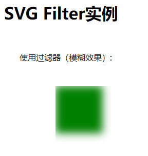
# 实例:阴影效果
<html> | |
<title>SVG Filter</title> | |
<body> | |
<h1>SVG Filter实例</h1> | |
<svg width="300" height="400"> | |
<defs> | |
<filter id="filter1" x="0" y="0"> | |
<feGaussianBlur in="SourceGraphic" stdDeviation="8" /> | |
</filter> | |
<filter id="filter2" x="0" y="0" width="200%" height="200%"> | |
<feOffset result="offOut" in="SourceAlpha" dx="20" dy="20" /> | |
<feGaussianBlur result="blurOut" in="offOut" stdDeviation="10" /> | |
<feBlend in="SourceGraphic" in2="blurOut" mode="normal" /> | |
</filter> | |
</defs> | |
<g> | |
<text x="30" y="50" >使用过滤器 (阴影效果): </text> | |
<rect x="100" y="100" width="90" height="90" stroke="green" stroke-width="3" | |
fill="green" filter="url(#filter2)" /> | |
</g> | |
</svg> | |
</body> | |
</html> |
# 输出
在 Chrome 浏览器上打开文件,你能用 Chrome/Firefox/Opera 或 IE9 + 直接看到 SVG 图像而不用任何插件,在 IE8 里需要使用 activeX 控件才能看 SVG 图像。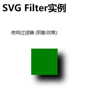