# 方法一:使用 border (常见)
【解释】不设置宽高,用边框大小控制三角型大小
【分解步骤】
# 设置一个 div 不设宽高
【示例】
<style> | |
#triangle{ | |
width: 0; | |
height: 0; | |
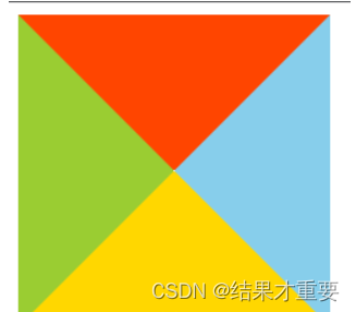
border: 100px solid; | |
border-color: orangered skyblue gold yellowgreen; | |
} | |
</style> |
# 设置透明
- 留下想要指向方向相反的边框设定,其他方向的边框设为
transparent透明
【示例】实现指向向上的三角形
<style> | |
.Up{ | |
width: 0; | |
height: 0; | |
border-top: 100px solid transparent; | |
border-right: 100px solid transparent; | |
border-left: 100px solid transparent; | |
border-bottom: 100px solid orangered; | |
} | |
</style> |
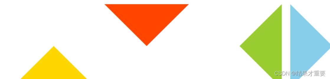
【效果图】指向上,指向下,指向左,指向右
# 如何设置不同的三角形
- 可以通过调整不同方向边框的值来实现不同方向和大小的三角形
# 方法二:使用 linear-gradient
【解释】两色渐变,调为实色,一色透明
【分解步骤】
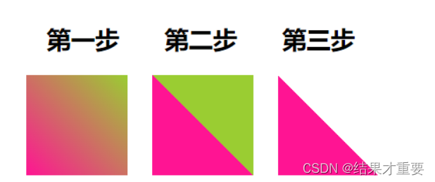
# 两色渐变
<style> | |
.first{ | |
background: linear-gradient(45deg, deeppink, yellowgreen); | |
} | |
</style> |
# 调为实色
<style> | |
.second{ | |
background: linear-gradient(45deg, deeppink, deeppink 50%, yellowgreen 50%, yellowgreen 100%); | |
} | |
</style> |
# 一色透明
<style> | |
.second{ | |
background: linear-gradient(45deg, deeppink, deeppink 50%, transparent 50%, transparent 100%); | |
} | |
</style> |
【效果图】
# 如何设置不同的三角形
- 通过旋转
rotate或者scale,也能得到各种角度,不同大小的三角形
# 方法三:使用 clip-path
【解释】裁剪多边型的方式,创建元素的可显示区域。区域内的部分显示,区域外的隐藏。
【示例】
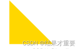
<style> | |
div{ | |
width: 100px; | |
height: 100px; | |
background: gold; | |
clip-path: polygon(0 0, 0 100%, 100% 100%); | |
} | |
</style> |
clip-path :
- polygon(
x1y1,x2y2,x3y3);
了解更多 clip-path 属性
【效果图】
# 如何设置不同的三角形
- 可以借助 CSS clip-path maker
# 方法四:利用字符
三角形形状的字符的十进制 Unicode 表示码
<div class="one">► </div> | |
<div class="two">▼ </div> | |
<div class="three">▲ </div> | |
<div class="four">⊿ </div> | |
<div class="five">△ </div> |
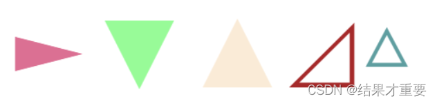
【注意】用 font-size 控制大小,用 color 控制颜色
# 空心三角形如何实现:
当 div 元素嵌套时可设置出空心三角形或是带三角形的气泡框。实例如下:
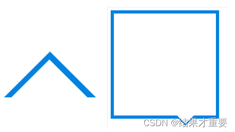
# 实现的核心思想 空心三角形
同样是使用三角形,加上伪类选择器 before 或 after。before 或 after 里设计一个三角形,其中一个背景颜色与环境颜色相同(一般为白色),用白色的三角形掩盖住另一个三角形即可达到三角形空心的目的。
注意:掩盖过程一般使用定位,容器设置为相对定位(不脱离文档流),三角形设置绝对定位。通过 top,left,bottom,right 调整位置即可。
这时为了达到掩盖效果,应使用 z-index 设置使背景色三角形能够掩盖另一个三角形。
带三角形的气泡框
本例实际可拆分为一个盒子和一个空心三角形。这时可同时设置 before 和 after。各自设置好边框组成三角形相互掩盖即可达到效果。
# 气泡框:
<!DOCTYPE html> | |
<html lang="zn-ch"> | |
<head> | |
<meta charset="UTF-8"> | |
<meta http-equiv="X-UA-Compatible" content="IE=edge"> | |
<meta name="viewport" content="width=device-width, initial-scale=1.0"> | |
<title>CSDN测试-实现带三角形的气泡框</title> | |
<style> | |
.div{ | |
width:300px; | |
height:300px; | |
border: 10px solid #0082df; | |
position: relative; | |
} | |
.div::after{ | |
content: ""; | |
position: absolute; | |
right:60px; | |
top:300px; | |
width:0px; | |
height:0px; | |
border:30px solid transparent; | |
border-top: 30px solid #0082df; | |
} | |
.div::before{ | |
content: ""; | |
position: absolute; | |
top:295px; | |
left:180px; | |
z-index: 1; | |
width:0px; | |
height: 0px; | |
border: 30px solid transparent; | |
border-top:30px solid #fff; | |
} | |
</style> | |
</head> | |
<body> | |
<div class="div"> | |
</div> | |
</body> | |
</html> |
# 空心三角形:
<!DOCTYPE html> | |
<html lang="zn-ch"> | |
<head> | |
<meta charset="UTF-8"> | |
<meta http-equiv="X-UA-Compatible" content="IE=edge"> | |
<meta name="viewport" content="width=device-width, initial-scale=1.0"> | |
<title>CSDN测试专用-实现空心三角形</title> | |
<style> | |
.div{ | |
width:0px; | |
height:0px; | |
border: 100px solid transparent; | |
border-bottom-color: #0082df; | |
position: relative; | |
} | |
.div::after{ | |
content: ""; | |
position: absolute; | |
right:-100px; | |
top:-80px; | |
width:0px; | |
height:0px; | |
border:100px solid transparent; | |
border-bottom-color: #fff ; | |
z-index: 2; | |
} | |
</style> | |
</head> | |
<body> | |
<div class="div"> | |
</div> | |
</body> | |
</html> |